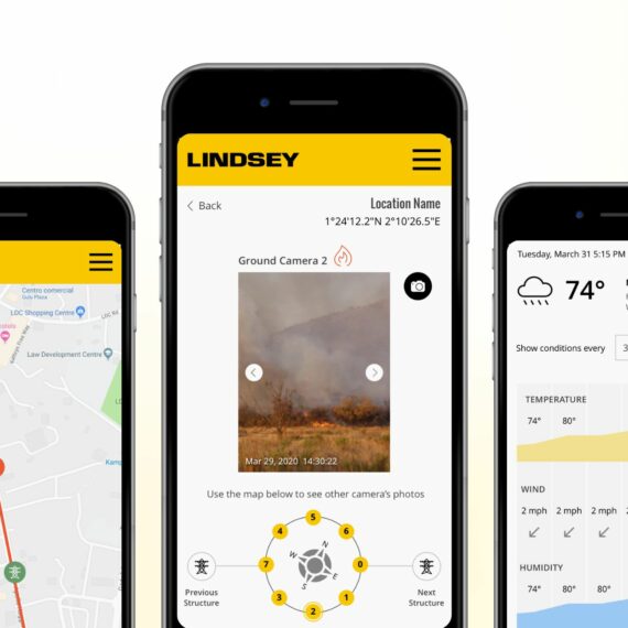
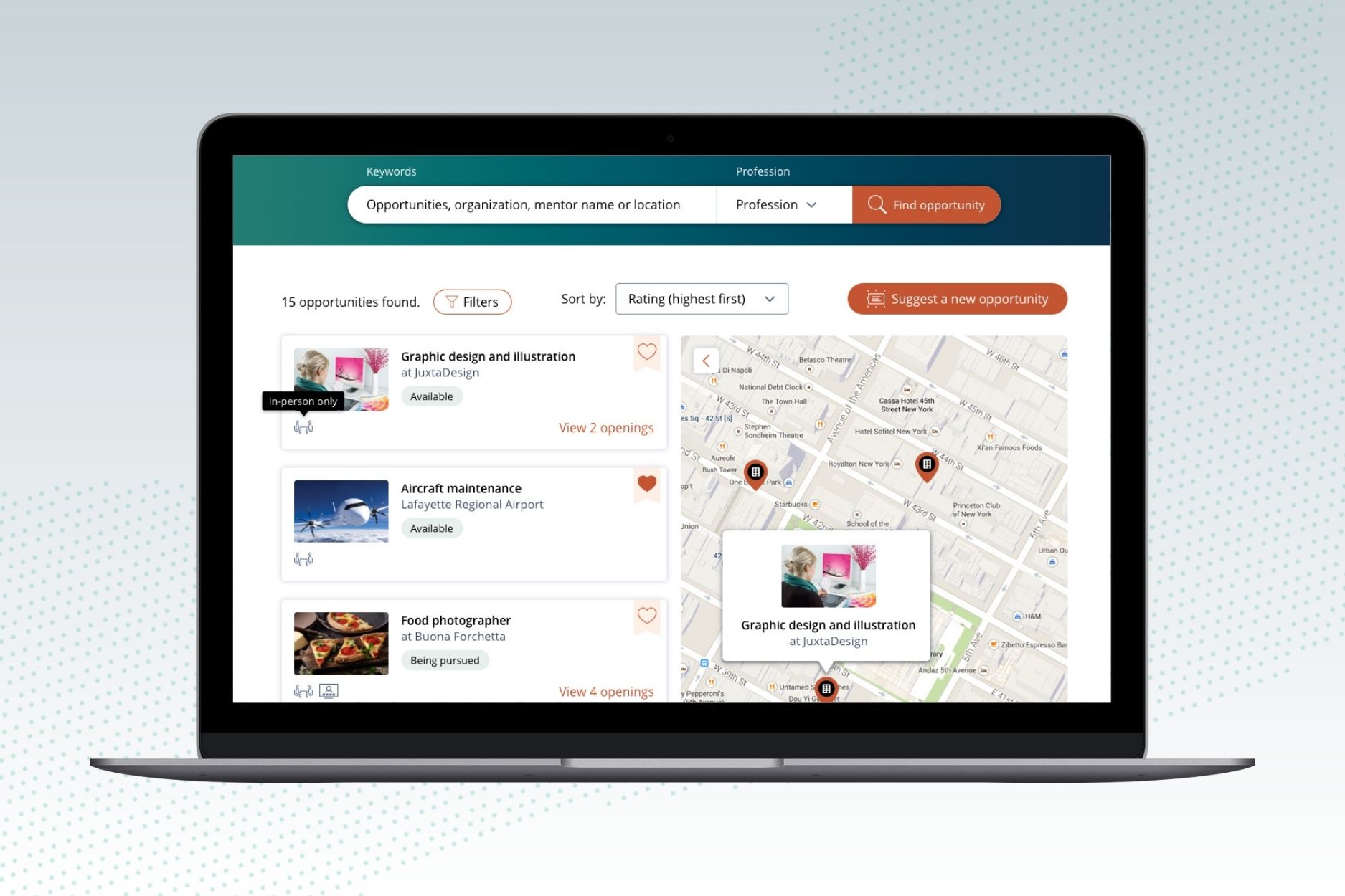
Students can search for real-world learning opportunities. The results are displayed as a list of cards and on a map. Additionally, students are empowered to propose new opportunities for inclusion in the database.
Internship management portal
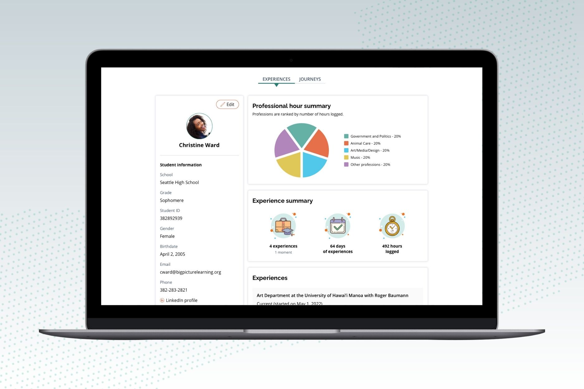
Students can keep track of their progress and accomplishments, including real-world experiences, mentor feedback, and profile data.
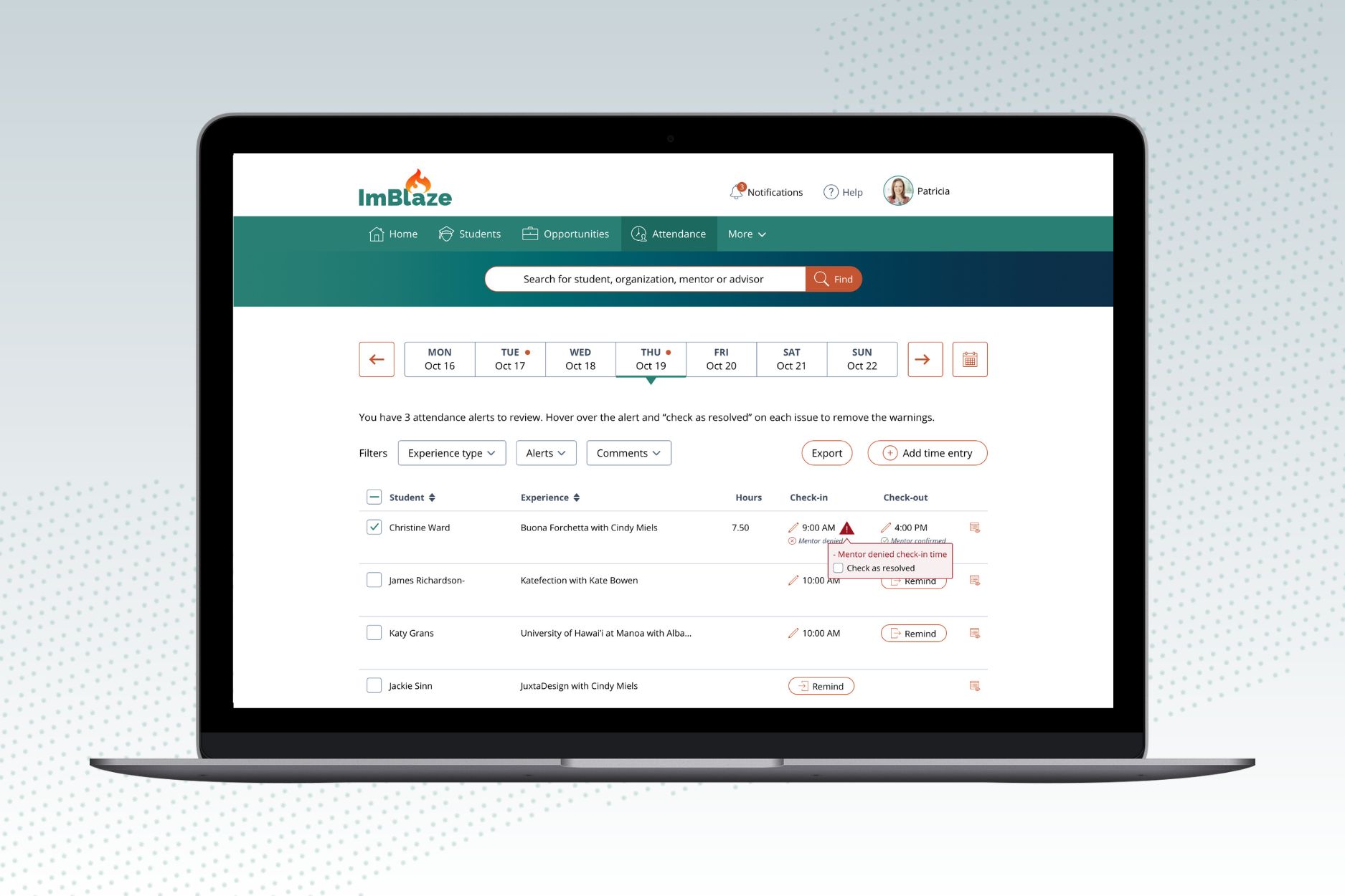
On a single screen, educators can monitor the attendance details of all their students. They can resolve automated attendance issues and send reminders to students for checking in or out.
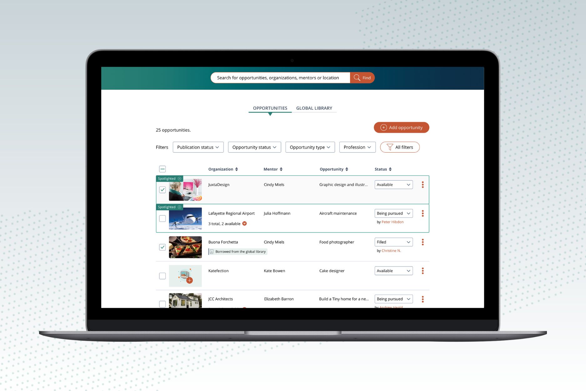
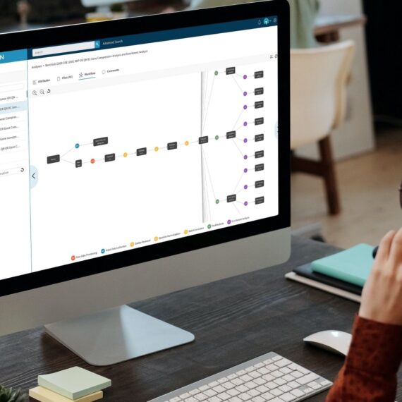
Educators have access to a searchable and filterable database of opportunities. Additionally, they can utilize an actions menu that features a dropdown list for quickly pairing a student with an opportunity, highlighting/cloning/archiving an opportunity, and sharing it with others.
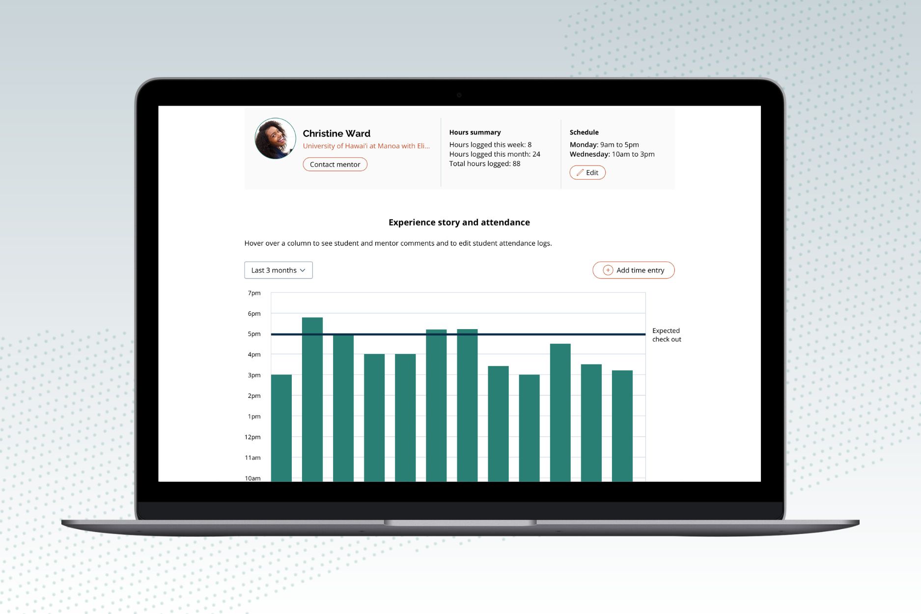
Educators can view the attendance records of each of their students. By clicking on the bars on the graph, they can open a modal screen that displays all the attendance information for that specific day.
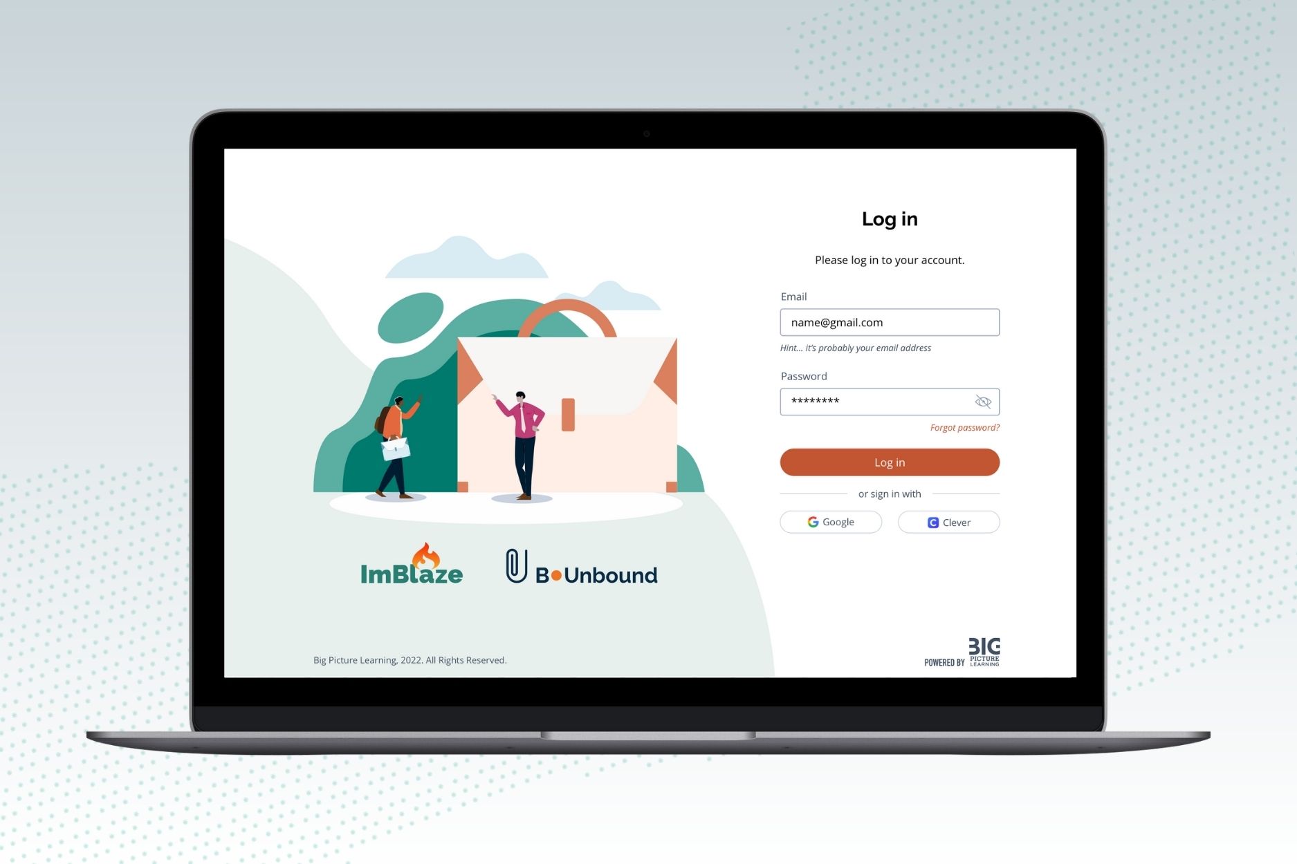
Login screens
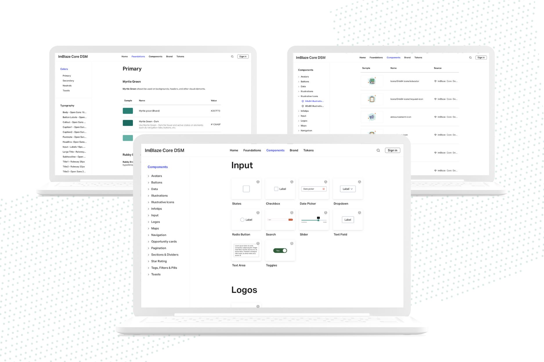
Design system with foundational elements such as typography and colors, branding guidelines, images and icons, components such as buttons, avatars, input fields, sliders, steppers, cards, etc.
Client Background
I have had a long-standing relationship with ImBlaze, having designed their original web app in 2016, followed by their student and educator apps in 2017 and 2021, respectively. In 2022, I was brought in again to revamp their web app with a new look, user experience (UX) enhancements, and additional functionality.
Discovery
I conducted discovery workshops to better understand ImBlaze’s objectives for the project, as well as user interviews with students and educators to identify their pain points and desired improvements.
Solution
Branding guidelines and design system
I created a fresh design for ImBlaze’s student and educator web app, including branding guidelines and a design system that featured colors, typography, icons, illustrations, and web app components for a cohesive look across all screens.
UX improvements
I overhauled every screen to streamline user processes and tasks. Notable UX improvements include:
- Homepages tailored to each user with essential content like tasks, request updates, and announcements.
- A much faster process for educators to add a new internship opportunity to their database while avoiding duplicates.
- An attendance page that made it easy for educators to monitor students’ attendance on a specific date, manage attendance warnings, and remind students to check in/out.
- A visual representation of student progress and accomplishments, including real-world experiences, mentor feedback, and profile data.
- A graph for educators to compare student check-in/out times with expected times, with detailed daily information available on a modal screen
- User-friendly filtering tools used across all screens.
- A global library of opportunities available for educators to borrow and add to their own database.
- Improved document compliance management for educators
- Enhanced internship search capabilities and an improved visual design for viewing internship details.
- A feature allowing students to log hours for other real-world learning experiences beyond internships.
Carolina is fantastic. I've worked with Carolina on 3+ projects over 2 years - including one long complex project with multiple iterations. Through and through she proved to be a gifted designer and a talented project manager who cared about the completion of our project as much as we do. Carolina, you are a pleasure to work with, and someone that I'm proud to say I learned a lot from!
Wilson Platt, Product Manager – ImBlaze
Role
As the only UX and UI designer, I was responsible for designing the entire user experience and user interface for this project.
Client
ImBlaze / Big Picture Learning