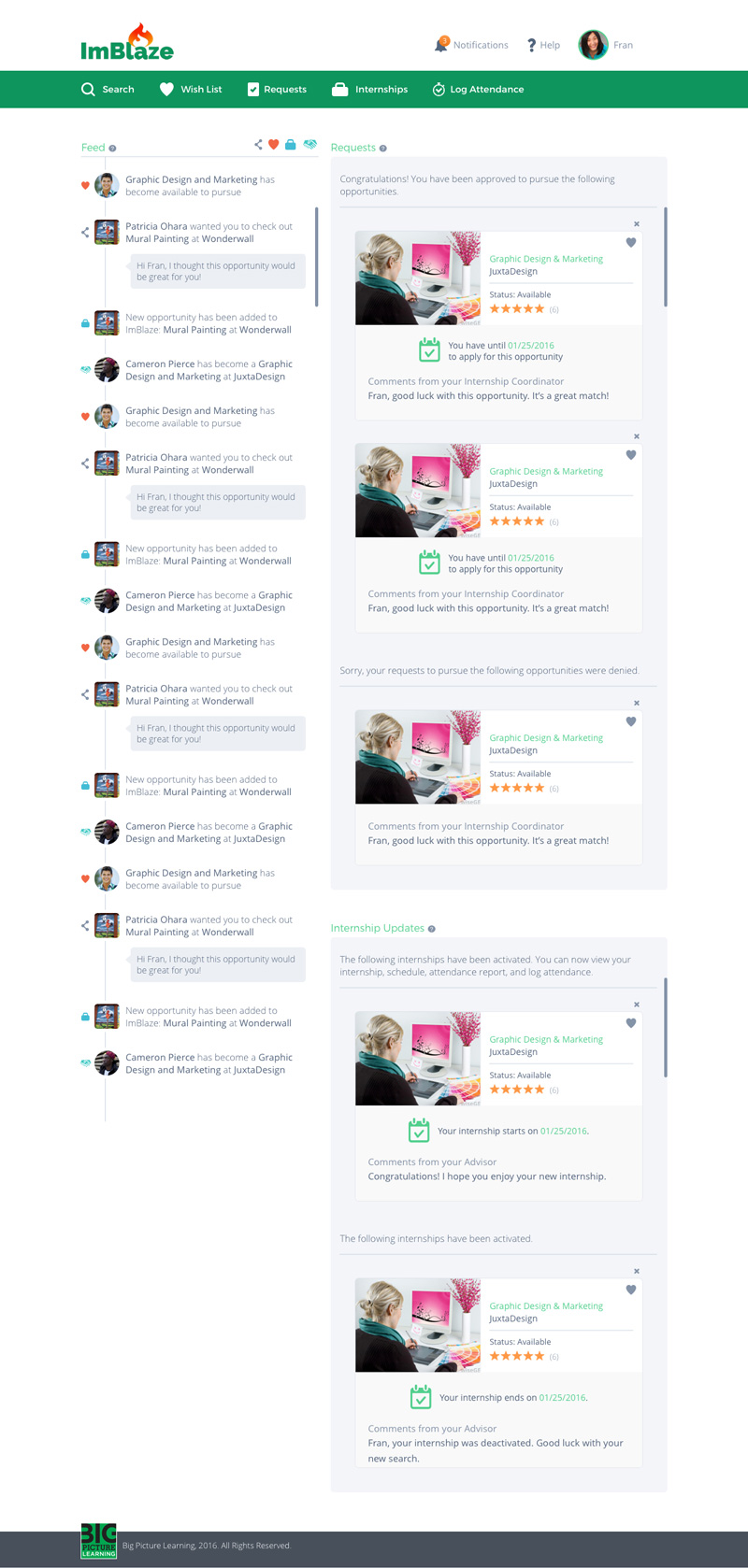
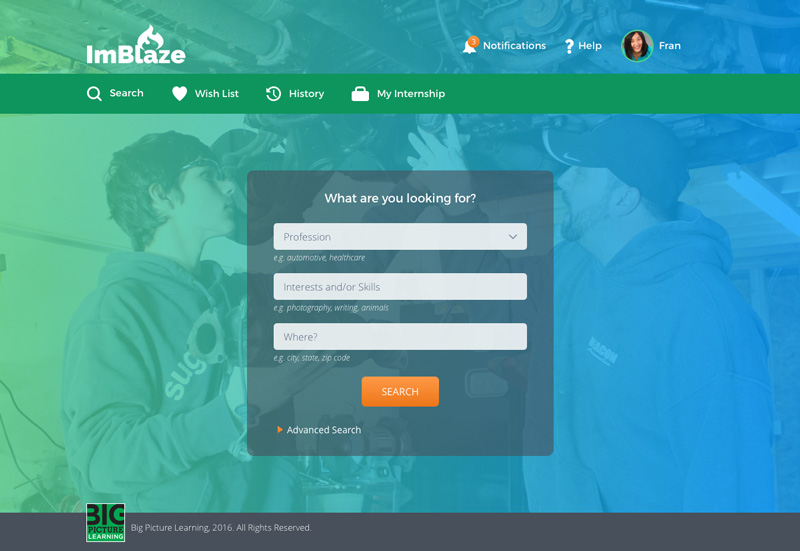
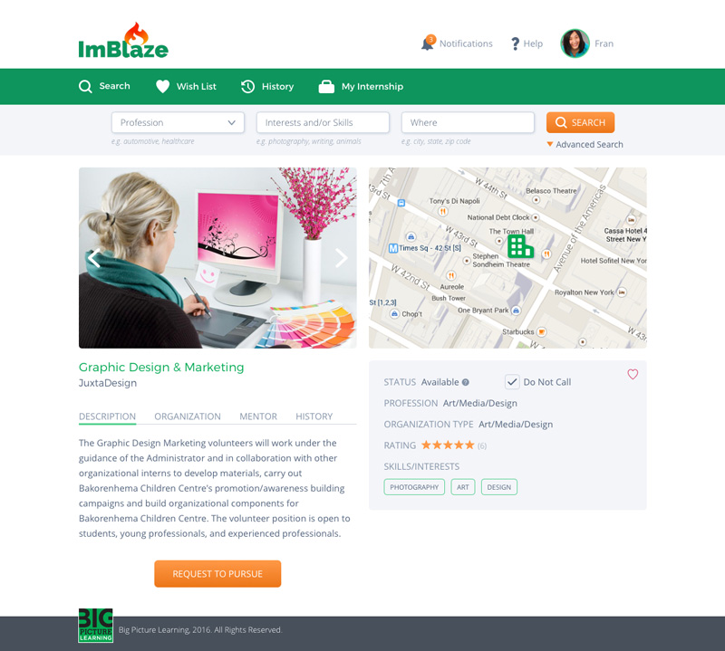
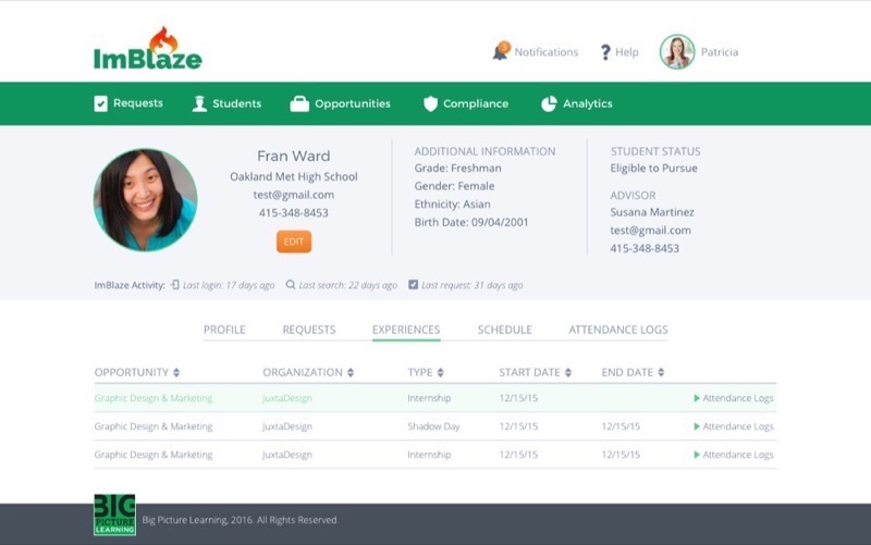
This case study pertains to the original design of the ImBlaze portal in 2016. In 2022, I was rehired to revamp the design.
ImBlaze UX case study
Background
To achieve its objective of expanding its real-world learning model to additional schools, ImBlaze required a platform capable of managing users and data. More than 60 partner schools were managing student records, internships, mentors, and compliance paperwork using Google spreadsheets and fusion tables. This approach proved to be not only inefficient and time-consuming but also frustrating for educators, as it prevented collaboration and led to duplicate records. Moreover, students found the process of requesting internships to be confusing and burdensome.
Solution
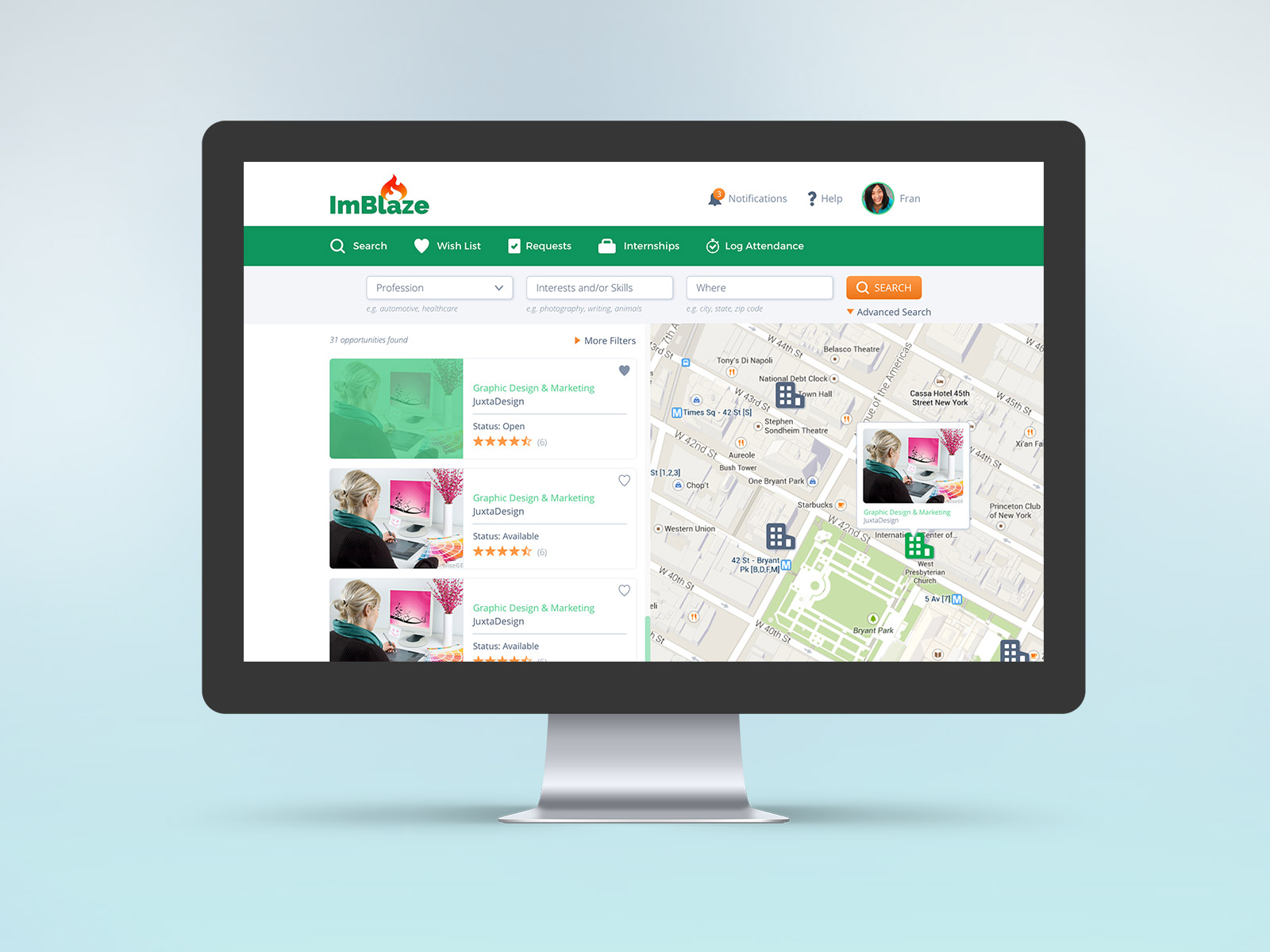
I designed ImBlaze, an internship management portal for students and educators. With this platform, users were able to achieve their main goals:
Student
- build a profile of interests
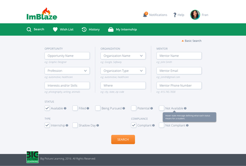
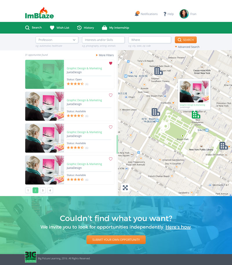
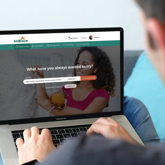
- search a curated database of internships
- create a list of favorites
- request to pursue internships
- view internship history
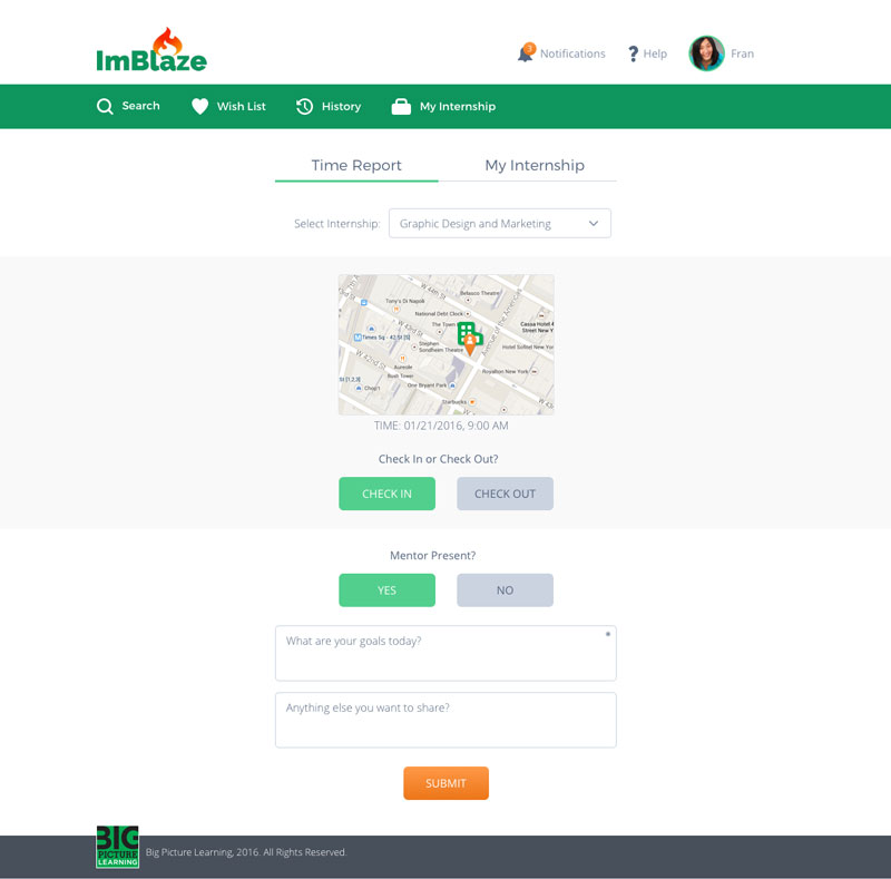
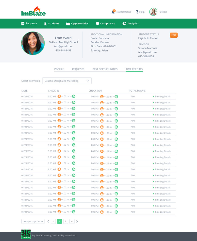
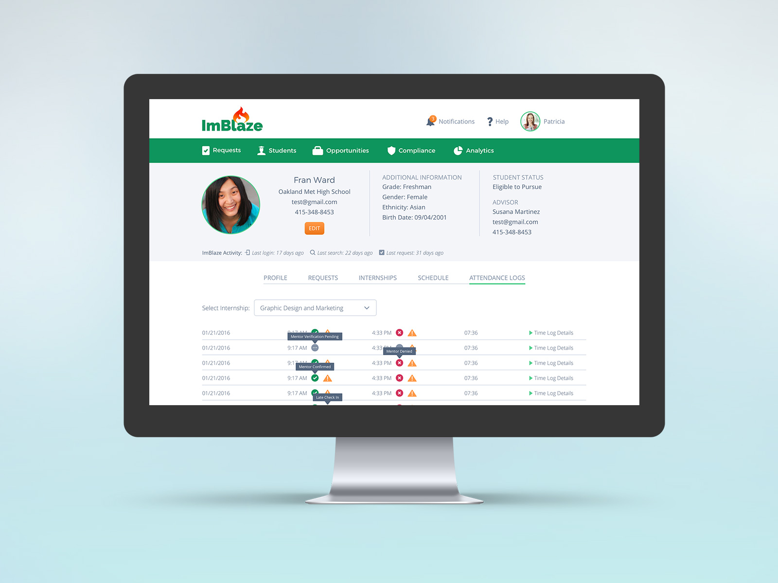
- log attendance
Educators
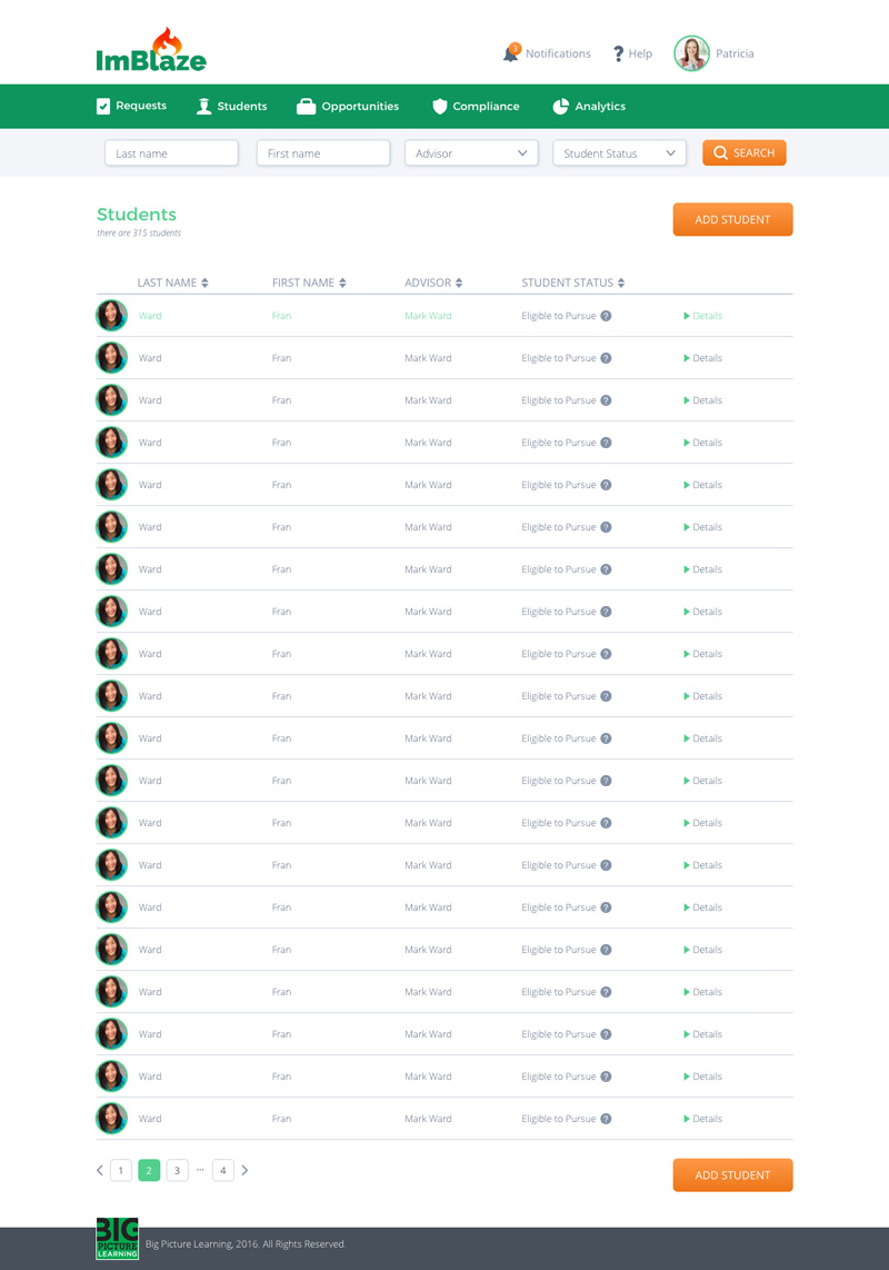
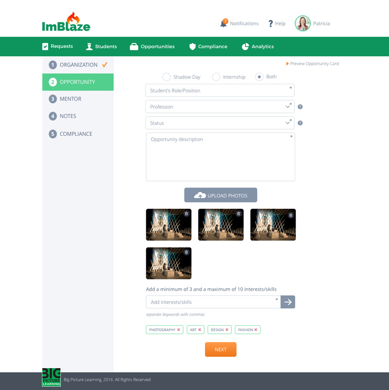
- create and manage student, internship and mentor databases
- oversee students’ profiles
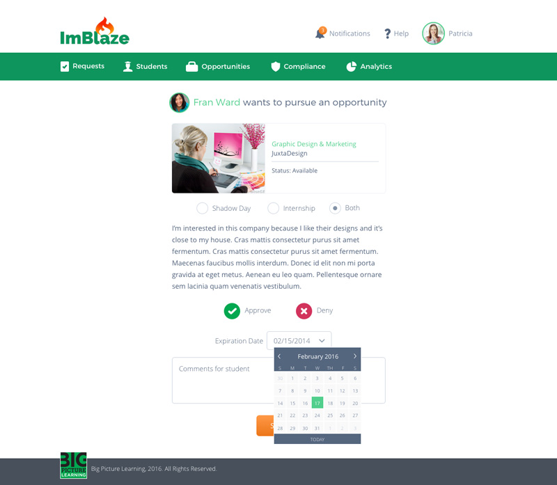
- approve/deny students’ requests
- create reports to monitor and evaluate students’ progress
- track of compliance
- be automatically reminded of pending tasks
Client
ImBlaze / Big Picture Learning
01. Discovery workshop
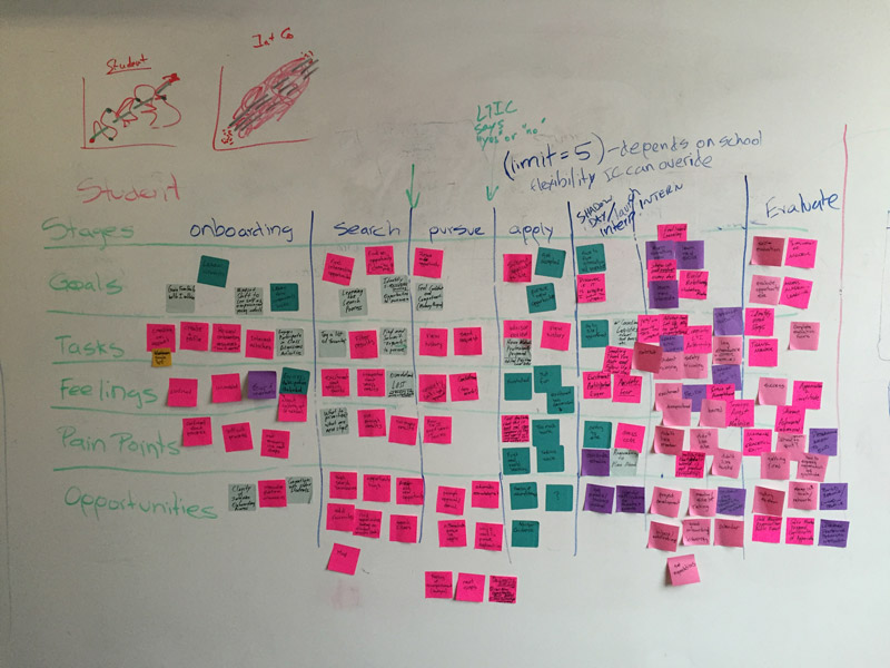
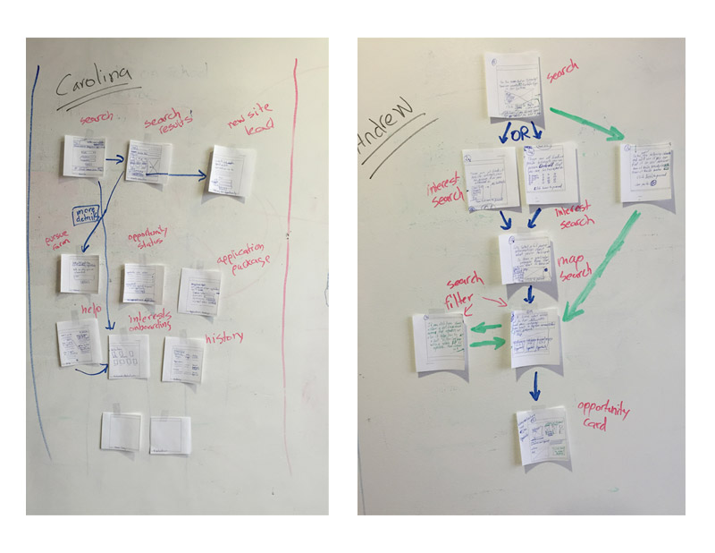
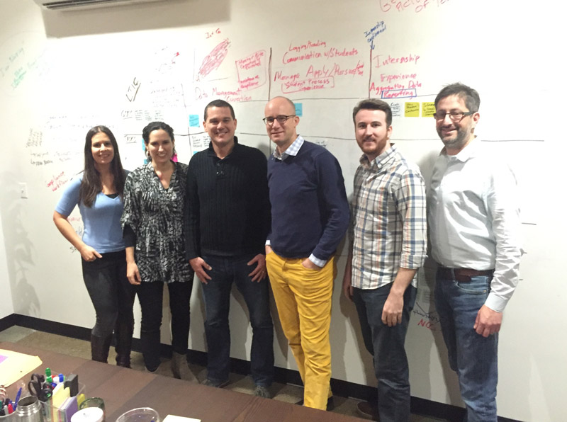
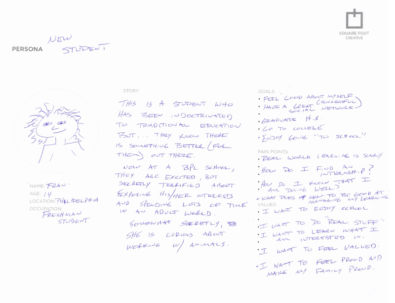
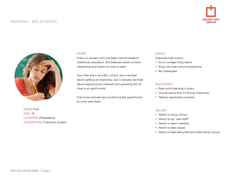
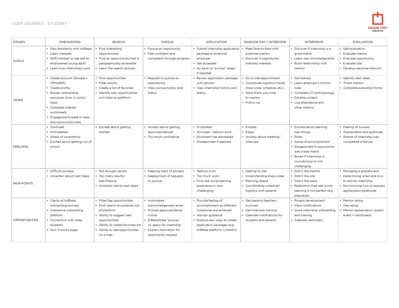
I led a 3-day discovery workshop for ImBlaze, which included several interactive exercises designed to understand the company’s primary business objectives, familiarize myself with the stakeholders and users, create personas and user journeys, evaluate direct and indirect competitors’ platforms, brainstorm and sketch initial solutions, and discuss visual design. I created a design brief that detailed the workshop outcomes and project strategy to ensure that our approach was in line with the client’s expectations.
02. High-fidelity wireframes, workflows and design review
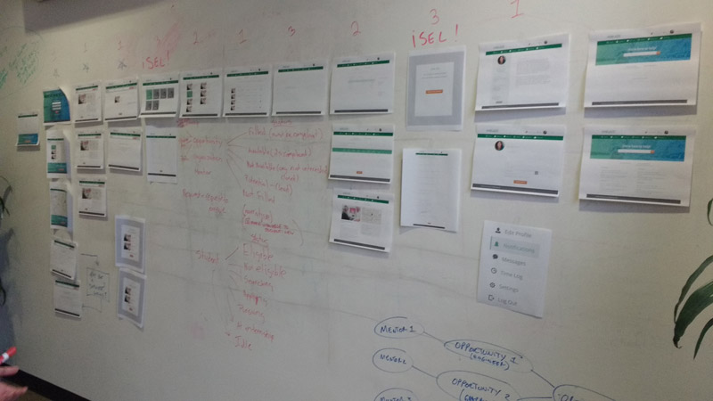
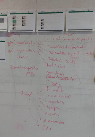
Within a timeframe of only 4 weeks, I developed 78 high-fidelity wireframes. When we reviewed our work with the ImBlaze team, we realized that some of the terminologies used by the staff were not user-friendly. As a result, we had to come up with new terms and provide definitions for both students and educators.
03. Mockups, prototypes and user-testing
I conducted testing of our designs at a BPL school with six students and six educators, utilizing paper prototypes during 30-minute testing sessions. The outcomes of the tests showed that our designs were intuitive, user-friendly, and efficient. During the sessions, I took note of instances where users faced difficulties navigating certain screens and revised the workflows accordingly. We received great feedback from the users, with requests for new features, which we integrated into the designs. We underwent five rounds of iterations before the mockups were ultimately approved.

